

Holiday Card Photo Mistakes to Avoid (and How to Fix Them!)
The perfect holiday card starts with the perfect photo — or at least a really good one.
Whether you're using professional family portraits, candid snapshots from your phone or a collection of memories from throughout the year, your photos play the biggest role in how your holiday card turns out. The good news? Most holiday card photo mistakes are easy to avoid once you know what to look for.
Before you upload your photos and place your order, review these holiday photography tips to make sure your Christmas cards look their absolute best.
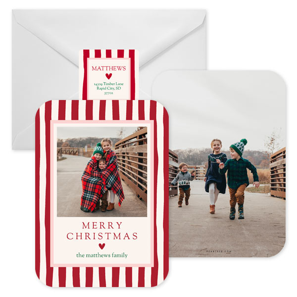
Featured Christmas Card: Festive Stripes
Mistake #1: Choosing Photos That Are Too Dark
One of the most common Christmas card photo mistakes is using photos that are darker than you realize.
A photo might look beautiful on your phone or computer screen, but keep in mind that screens are backlit. Printed cards don't have that built-in glow, which means photos often print slightly darker than they appear on your device.
When selecting images for your holiday card:
- Choose bright, well-lit photos whenever possible.
- Avoid heavy shadows across faces.
- Skip overly dark filters and dramatic edits.
- Make sure eyes and facial expressions are clearly visible.
- Increase brightness slightly if needed before uploading.
Think light and bright. Your holiday card should make friends and family smile, not squint to figure out who's in the picture!
Pro Tip:
Outdoor photos taken during the golden hour (shortly after sunrise or before sunset) often provide the soft, flattering light that looks amazing on holiday cards.
Mistake #2: Not Thinking About Card Trim and Bleed
Here's something many people don't realize: your holiday card design includes a small bleed area around the edges that may be trimmed during production.
That means if someone's head, foot, hand or important detail is already close to the edge of your photo, it could end up getting cropped.
One of the easiest holiday photo mistakes to avoid is simply giving your subjects a little breathing room.
When choosing photos:
- Keep faces comfortably inside the frame.
- Avoid photos where heads touch the top edge.
- Leave space around feet and hands.
- Be mindful of important background details near the edges.
If you're planning a family photo session specifically for your holiday card, ask your photographer to shoot a variety of wider compositions. Those extra inches around your family can make a big difference when designing your card.

Featured Christmas Card: Meet the Family
Mistake #3: Forgetting Basic Photo Composition
You don't need professional photography experience to create a beautiful holiday card photo.
A few simple composition tricks can instantly elevate your images.
Keep the Background Clean
Look beyond your family and check what's happening in the background. Distracting signs, parked cars, trash cans or random strangers can pull attention away from your subjects.
Create Visual Balance
Try to avoid bunching everyone into one side of the frame. A balanced composition often feels more polished and intentional.
Capture Connection
Some of the best family holiday photo tips have nothing to do with posing. Genuine smiles, laughter, hugs and natural interactions often create more memorable photos than everyone staring directly at the camera.
Leave Space for Text
Many holiday card designs include room for names, greetings or holiday messages. Photos with some open space can give designers more flexibility and create a cleaner finished look.
Mistake #4: Waiting Until the Last Minute to Plan Outfits
Wondering what to wear for holiday photos?
The secret isn't matching outfits. It's coordinating colors.
The best holiday photos feel cohesive without looking overly staged. Start by selecting a color palette and then choose Christmas card outfits that complement one another.
Popular holiday photo color combinations include:
- Cream, tan and sage green
- Navy, gray and burgundy
- Forest green and ivory
- Dusty blue and neutral tones
- Black, camel and white
Try to avoid:
- Neon colors
- Large logos
- Busy graphics
- Clothing with lots of competing patterns
Most importantly, wear something comfortable. If family members feel confident and relaxed, it will show in the photos.
Mistake #5: Using Screenshots of Professional Photos
This is a surprisingly common mistake — and one that can seriously affect print quality.
If you've hired a professional photographer, always use the original image files they provided.
Avoid:
- Taking screenshots of your gallery
- Downloading images from Facebook
- Saving photos from Instagram
- Using photos sent through text messages
Every time an image is uploaded, shared or compressed, it loses quality. What looks perfectly fine online can appear blurry or pixelated when enlarged and printed.
When it comes to professional photos, always use the highest-resolution original file available.
Mistake #6: Assuming All Mobile Photos Are Print-Ready
Today's smartphones take incredible photos, but not every phone photo belongs on a holiday card.
The same rules apply whether your photo was taken with a professional camera or your mobile phone.
Look for images that are:
- Sharp and in focus
- Well lit
- High resolution
- Free from heavy filters
- Original files from your camera roll
Avoid:
- Screenshots
- Zoomed-in photos
- Images downloaded from social media
- Photos that appear blurry when enlarged
Remember, holiday cards are often viewed up close. The better the image quality, the better the final card will look.
Mistake #7: Trying to Choose Just One Photo
Can't decide on a favorite photo? You don't have to.
Some of the most fun holiday cards are year-in-review designs that showcase multiple memories from throughout the year.
If you have:
- Vacation photos
- Sports highlights
- School milestones
- Pet pictures
- Birthday celebrations
- Everyday family moments
Consider a multi-photo card with lots of photo boxes.
A year-in-review card tells a bigger story and takes some of the pressure off finding that one perfect image. It's also a wonderful way to share more of your family's year with friends and relatives.
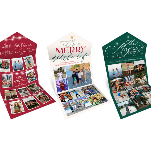
Featured Christmas Card: Little Moments Seal and Send, Merry Little Life Seal and Send, Magic Memories Seal and Send
Create a Holiday Card You'll Love
The best holiday cards aren't necessarily the most professionally photographed or perfectly posed. They're the ones that capture the people, moments and memories that matter most.
By avoiding these common holiday card photo mistakes, choosing bright and high-quality images, coordinating outfits thoughtfully and paying attention to composition, you'll create a card that looks beautiful both on your screen and in your mailbox.
A little extra attention to your photos now can make all the difference when your holiday cards arrive — and when loved ones display them all season long.
Common Questions About Holiday Card Photos
1. What are the most common holiday card photo mistakes?
The most common mistakes include using photos that are too dark, poor composition, low-resolution images, ignoring card trim and bleed areas, and selecting photos that are not print-ready.
2. Why do my holiday card photos look darker when printed?
Photos often print darker because screens are backlit, which makes images appear brighter online. It’s best to choose well-lit photos and slightly increase brightness before uploading.
3. What should I avoid when choosing photos for Christmas cards?
Avoid dark or blurry images, heavy filters, screenshots, and photos with distracting backgrounds. Also avoid images where important details are too close to the edge of the frame.
4. How do I make sure my photo fits properly on a holiday card?
Keep faces and key details centered and away from the edges of the photo. Leave extra space around subjects so nothing gets cropped during printing due to trim and bleed.
5. What makes a good holiday card photo composition?
A good composition has a clean background, balanced framing, and natural expressions. Photos with genuine interactions like smiles and hugs often look more authentic and engaging.
6. What colors should I wear for holiday card photos?
Coordinated color palettes work best. Popular choices include navy and burgundy, cream and sage green, forest green and ivory, or neutral tones like black, camel, and white. Avoid neon colors and busy patterns.
7. Can I use smartphone photos for Christmas cards?
Yes, smartphone photos can work well if they are sharp, well-lit, high-resolution, and unfiltered. Avoid screenshots, zoomed images, or photos downloaded from social media.
8. Why shouldn’t I use screenshots of professional photos for my holiday card?
Screenshots reduce image quality and can cause photos to appear blurry or pixelated when printed. Always use the original high-resolution image files from your photographer.
9. Do I have to use only one photo on a holiday card?
No, you can use multiple photos. Year-in-review or collage-style cards are popular and allow you to showcase different memories like vacations, milestones, and everyday moments.
10. What type of lighting is best for holiday card photos?
Natural light is best, especially soft outdoor light during golden hour (shortly after sunrise or before sunset). It creates a warm, flattering look for family photos.
